Tuesday, November 30, 2010
Friday, August 27, 2010
New Web Site Project Up And Running
Recently completed web site for Ceto Builders, a Reno-based building/contracting company.
I used Wordpress for the structure of the site so that the client can make changes and additions. Wordpress is a great structure to provide a Client Managed (CMS) web site. I included some plugins that extend the Wordpress system. Plugins that help with Search Engine Optimization (SEO), Slideshow and gallery presentations, contact form and other functions.
The site itself is a heavily modified version of the 2010 theme that comes with the Wordpress installation.
My client can now enjoy all the tools of a Wordpress web site. They can even have a blog if they desire since that was what Wordpress was designed for.
Friday, August 6, 2010
8th Continent Soymilk's Design Rocks!
I just saw 8th Continent's soymilk cartons in the supermarket yesterday. They really stand out in the milk aisle. Their use of illustration is really nice since most milk product packaging design if fairly conservative. Check out their site too-they have carried the branding through nicely.
There is no indication of the firm that created the packaging design, the web design or illustrator but kudos to them.
Friday, April 9, 2010
iPhone camera apps
Some experiments with a couple iPhone camera apps.
Lo-Mob and Hipstamatic.
Each has it's own merits. Hipstamatic has more toy camera effects. Lo-Mob is more of a alternative photo-type app. It gives options of different emulsions and border effects.
Lo-mob does have a nice feature to be able to upload your photo to Twitter, Flickr, Facebook or Picasa built right into the app.
Lot's of fun. Makes me miss taking pics with my trusty Holga and through-the-viewfinder Duaflex.
For more info.:
Hipstamatic
Lo-Mob
Onto to picture show...
Tuesday, March 30, 2010
Friday, March 26, 2010
Tomi Ungerer - Graphic Icon
One of my favorite illustrator/artists is Tomi Ungerer. I first was exposed to his work in college. He created some really imaginative and iconic images. From the New York Times article cited below: "Phaidon Press, the London art-book publisher, described him recently as “the most famous children’s book author you have never heard of.”" There doesn't seem to be one really comprehensive source for his work so I pulled together these images.
Here are a few places to read up:
Thursday, March 18, 2010
How to: Create Textures for design projects
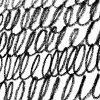
 I like creating textures that I can use in my design and illustration work. I like to create them with traditional methods and scan them. For me, this method is easier than using digital brushes in Photoshop and results in more organic textures.
Once you get the hang of this, the sky is the limit as to the materials you can use and textures you can create. And, when you have them scanned, you can combine textures to get even more variety.
I think that adding these textures to design projects can make any piece stand out.
Tools: acrylic paint, watercolor paints, colored pencils, charcoal, paper, cardboard, etc.
(top left: paint splatters/drips and loop texture created with pencil)
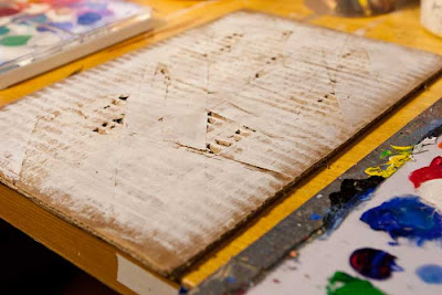
 For this texture, I decided to see what I could get out of cardboard. It has a kind of built in texture because of the layered nature of the product. I set to cut it up to expose the inside thinking I could get an industrial, decayed, worn type of texture. I cut up the surface with a utililty knife(careful, that blade is sharp) and peeled off random sections to reveal the cardboard structure below. I then painted the surface white kind of skimming the surface to reveal more of the texture. This method is called "scumbling" in painting lingo. I used white because I wanted the lines cut into the cardboard to be black in the final version of the texture.
Textures used in my illustration work.
From a series of textures that I call, "Acid Wash"
Subscribe to:
Comments (Atom)


